First, take a look the completed chart below. This is what you will be creating.
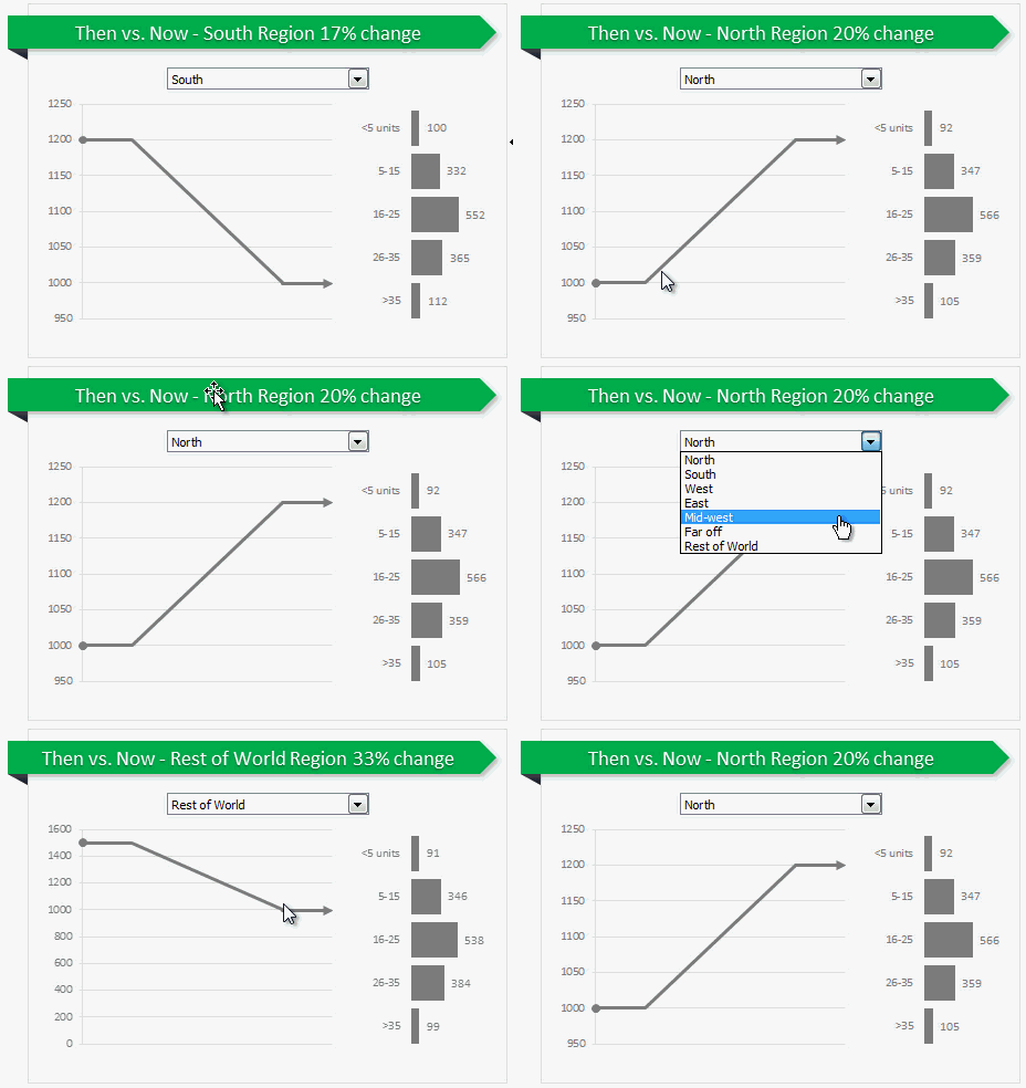
Inspiration for this chart
Before we jump in to Excel and understand how this is done, let me thank NY Times for providing the inspiration for this chart.
Creating Then vs. Now chart in Excel
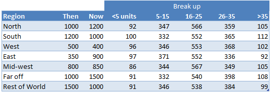
1. Arrange data
As usual, the first step is to get the data in to Excel. Structure your data like this.
2. Insert a combo box control to select a region
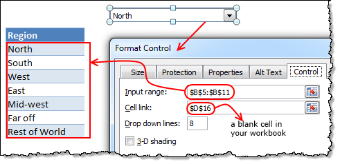 Since our chart will display values for one region at a time, we need a mechanism to let user control which region is displayed. We will use a combo box control do this. Follow these steps.
- Go to developer ribbon and insert combo box form control.
- Right click on the combo box and go to format control.
- Set up input range to list of regions in your data.
- Set up cell link to a blank cell in your workbook.
3. Fetch selected region’s data
Now that we have a combo box to select which region to show in the chart, next step is to fetch data for selected region. You can use either VLOOKUP or INDEX formulas to do it.
Using VLOOKUP formula:
Assuming region name is in D17, and data is in values table, write:
=VLOOKUP(D17, values, 2, false)
to get 2nd column (then sales) value.
Using INDEX formula:
Assuming region number is in D16, and data is in values table, write:
=INDEX(values[then],D16)
4. Create a chart showing then to now movement
Next step is to create a chart that would show a line going from then value to now value. Lets take a closer look the line to understand how to make it in Excel.
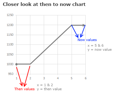
We can create this chart with either XY (scatter) plot or line chart. Lets go with scatter plot.
In your workbook, set up a table like this:
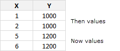
Then, select the above and create a scatter plot. Select the scatter plot with connecting lines.
5. Formatting the chart
Since we want to show a thick circle at the beginning of then value and arrow at the end of now value, lets go ahead and do the formatting song and dance.
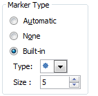 Formatting the first point:
- Select the first point of then values (you need to click once on it, take 3 deep breaths, click again and sacrifice a goat).
- Press CTRL+1 to format the data point.
- Go to Marker options and select built in marker and use the circle symbol.
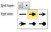 Formatting the last point:
- Select the last point (same as above, but this time sacrifice a chicken)
- Format the data point.
- Go to line style, select End type and choose arrow.
 Formatting the horizontal axis:
- Select horizontal (x) axis and press CTRL+1
- Set axis minimum to 1, maximum to 6.
- Click ok and delete the axis as we do not need it on the chart.
6. Adding “Break-up” of now values chart
This is easy, Just select fetched break-up values for selected region and create a bar chart. Format it as per your fancy.
7. Put everything together
Place the combo box, scatter plot and bar chart together in a nice fashion. Add a surrounding box shape so that everything looks like one report.
Add a descripttive title on the top. If possible, make chart title dynamic so that you can show the selected region name and % change in it.
8. Your Then vs. Now chart is ready
That is all. Your Then vs. Now chart is ready. Go ahead and flaunt it.
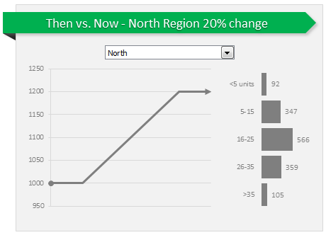
Now the chart is ready!!!!!!!!!!
Regards,
KumarMukesh
Attached File : 304961 1216748 then vs now interactive chart.xlsx downloaded: 216 times


 CAclubindia
