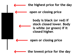
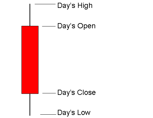
The component of a candlestick chart that represents a downward movement in the underlying price. A red candlestick is composed of the period's high, low, opening and closing prices. If the closing price is lower than the day's opening price, then the body of the candle is red or black.
Also known as a "black candlestick" or a "closed candlestick".
Investopedia explains Red Candlestick
Charts are primarily used in technical analysis. A red candle quickly conveys a downward movement as well as the range of the price for the day. The longer the candle, the greater the price movement.
Most charting software will allow you to change the colors of these candles. Even though red and black are common colors for this type of candlestick, any color can be used.
What Does White Candlestick Mean?
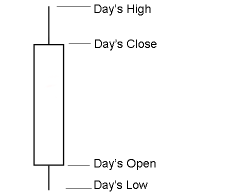
A point on a candle stick chart representing a day in which the underlying price has moved up. Candlesticks will have a body and usually two wicks on each end. The bottom of the white body represents the opening price and the top of the body represents the closing price. The top and bottom tips of each wick are the day's highest and lowest price respectively.
Also known as an "open candlestick."
Investopedia explains White Candlestick
Candlestick charts are primarily used by technical traders because of how quick a day's price movement is conveyed. There are many formations which can be used as a buy, sell or hold indicator.
Red/black candlesticks represent a downward movement for the day, which are opposite of white candle sticks.
Most charting software will allow you to change the colors of these candles. Even though white is the common color for this type of candlestick, any color can and is used by traders.
by Investopedia Staff, (Investopedia.com) (Contact Author | Biography)
Email Article
Print
Feedback
Reprints
Filed Under: Active Trading, Futures, Stock Analysis, Technical Analysis
The candlestick techniques we use today originated in the style of technical charting used by the Japanese for over 100 years before the West developed the bar and point-and-figureanalysis systems. In the 1700s, a Japanese man named Homma, a trader in the futures market, discovered that, although there was a link between price and the supply and demand of rice, the markets were strongly influenced by the emotions of traders. He understood that when emotions played into the equation, a vast difference between the value and the price of rice occurred. This difference between the value and the price is as applicable to stocks today as it was to rice in Japan centuries ago. The principles established by Homma are the basis for the candlestick chart analysis, which is used to measure market emotions surrounding a stock.
This charting technique has become very popular among traders. One reason is that the charts reflect only short-term outlooks, sometimes lasting less than eight to 10 trading sessions. Candlestick charting is a very complex and sometimes difficult system to understand. Here we get things started by looking at what a candlestick pattern is and what it can tell you about a stock.
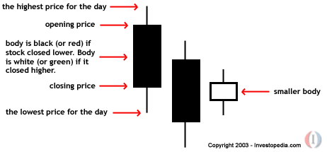
Candlestick Components
When first looking at a candlestick chart, the student of the more common bar charts may be confused; however, just like a bar chart, the daily candlestick line contains the market's open, high, low and close of a specific day. Now this is where the system takes on a whole new look: the candlestick has a wide part, which is called the "real body". This real body represents the range between the open and close of that day's trading. When the real body is filled in or black, it means the close was lower than the open. If the real body is empty, it means the opposite: the close was higher than the open.
Figure 1: A candlestick
Just above and below the real body are the "shadows". Chartists have always thought of these as the wicks of the candle, and it is the shadows that show the high and low prices of that day's trading. If the upper shadow on the filled-in body is short, it indicates that the open that day was closer to the high of the day. A short upper shadow on a white or unfilled body dictates that the close was near the high. The relationship between the day's open, high, low and close determines the look of the daily candlestick. Real bodies can be either long or short and either black or white. Shadows can also be either long or short.
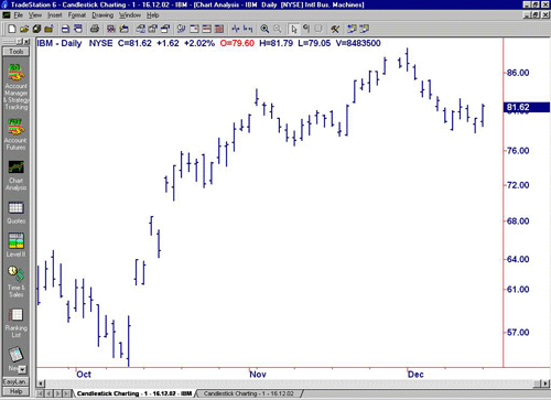
Comparing Candlestick to Bar Charts A big difference between the bar charts common in North America and the Japanese candlestick line is the relationship between opening and closing prices. We place more emphasis on the progression of today's closing price from yesterday's close. In Japan, chartists are more interested in the relationship between the closing price and the opening price of the same trading day.
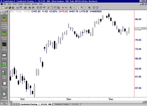
In the two charts below we are showing the exact same daily charts of IBM to illustrate the difference between the bar chart and the candlestick chart. In both charts you can see the overall trend of the stock price; however, you can see how much easier looking at the change in body color of the candlestick chart is for interpreting the day-to-day sentiment.
Figure 2: Daily bar chart of IBM
Source: TradeStation
Figure 3: Daily candlestick chart of IBM
Source: TradeStation
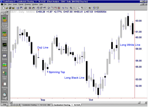
Basic Candlestick Patterns In the chart below of EBAY, you see the "long black body" or "long black line". The long black line represents a bearish period in the marketplace. During the trading session, the price of the stock was up and down in a wide range and it opened near the high and closed near the low of the day.
By representing a bullish period, the "long white body", or "long white line"-(in the EBAY chart below, the white is actually gray because of the white background) is the exact opposite of the long black line. Prices were all over the map during the day, but the stock opened near the low of the day and closed near the high.
Spinning tops are very small bodies and can be either black or white. This pattern shows a very tight trading range between the open and the close, and it is considered somewhat neutral.
Doji lines illustrate periods in which the opening and closing prices for the period are very close or exactly the same. You will also notice that, when you start to look deep into candlestick patterns, the length of the shadows can vary.
Figure 4: Daily chart of EBAY showing Doji lines and spinning tops
Source: TradeStation
The Bottom Line
The candlestick charting pattern is one that any experienced trader must know. As Japanese rice traders discovered centuries ago, investors' emotions surrounding the trading of an asset have a major impact on that asset's movement. Candlesticks help traders to gauge the emotions surrounding a stock, and thus make better predictions about where that stock might be headed.
by Investopedia Staff, (Contact Author | Biography)
Investopedia.com believes that individuals can excel at managing their financial affairs. As such, we strive to provide free educational content and tools to empower individual investors, including thousands of original and objective articles and tutorials on a wide variety of financial topics.
What Does Bullish Harami Mean?
A candlestick chart pattern in which a large candlestick is followed by a smaller candlestick whose body is located within the vertical range of the larger body. In terms of candlestick colors, the bullish harami is a downtrend of negative-colored (black) candlesticks engulfing a small positive (white) candlestick, giving a sign of a reversal of the downward trend.
Investopedia explains Bullish Harami
Because the bullish harami indicates that the falling trend (bearish trend) may be reversing, it signals that it's a good time to enter into a long position. The smaller the second (white) candlestick, the more likely the reversal
What Does Heikin-Ashi Technique Mean?
A type of candlestick chart that shares many characteristics with standard candlestick charts, but differs because of the values used to create each bar. Instead of using the open-high-low-close (OHLC) bars like standard candlestick charts, the Heikin-Ashi technique uses a modified formula:
Close = (Open+High+Low+Close)/4
Open = [Open (previous bar) + Close (previous bar)]/2
High = Max (High,Open,Close)
Low = Min (Low,Open, Close)
Investopedia explains Heikin-Ashi Technique
The Heikin-Ashi technique is used by technical traders to identify a given trend more easily. Hollow candles with no lower shadows are used to signal a strong uptrend, while filled candles with no higher shadow are used to identify a strong downtrend.
This technique should be used in combination with standard candlestick charts or other indicators to provide a technical trader the information needed to make a profitable trade.
A small line found on a candle in a candlestick chart that is used to indicate where the price of a stock has fluctuated relative to the opening and closing prices. Essentially, these shadows illustrate the highest and lowest prices at which a security has traded over a specific time period.
Investopedia explains Shadow
A shadow can be located either above the opening price or below the closing price. When there is a long shadow on the bottom of the candle (like that of a hammer) there is a suggestion of an increased level of buying and, depending on the pattern, potentially a bottom.
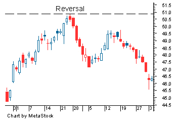
What Does Reversal Mean?
A change in the direction of a price trend. On a price chart, reversals undergo a recognizable change in the price structure. An uptrend, which is a series of higher highs and higher lows, reverses into a downtrend by changing to a series of lower highs and lower lows. A downtrend, which is a series of lower highs and lower lows, reverses into an uptrend by changing to a series of higher highs and higher lows.
Also referred to as a "trend reversal", "rally" or "correction".
Investopedia explains Reversal
A reversal can be a positive or negative change against the prevailing trend. Technical analysts watch for these patterns because they can indicate the need for a different trading strategy on the same security.
For example, if a technical analyst holds stock ABC and notices a reversal pattern, he or she may want to consider closing his or her existing long position and assuming a short position to capitalize on the potential downward movement of the stock's price.
What Does Upside Tasuki Gap Mean?
A candlestick formation that is commonly used to signal the continuation of the current trend. The pattern is formed when a series of candlesticks have demonstrated the following:
1. The bar is a large white candlestick within a defined uptrend.
2. The second bar is another white candlestick that has gapped above the close of the previous bar.
3. The last bar is a red candlestick that closes within the gap between the first two bars. It is important to note that the red candle does not need to fully close the gap.
Investopedia explains Upside Tasuki Gap
In technical analysis, it is not uncommon to see the price of the asset close the gap created in the price. Sometimes traders get ahead of themselves and send the price higher too quickly, which can result in a slight pullback. The red candlestick that forms the upside tasuiki gap is as a period of slight consolidation before the bulls continue to send the price higher.
What Does Doji Mean?
A name for candlesticks that provide information on their own and also feature in a number of important patterns. Dojis form when a security's open and close are virtually equal.
Investopedia explains Doji
A doji candlestick looks like a cross, inverted cross, or plus sign. Alone, doji are neutral patterns
What Does Evening Star Mean?
A bearish candlestick pattern consisting of three candles that have demonstrated the following characteristics:
1. The first bar is a large white candlestick located within an uptrend.
2. The middle bar is a small-bodied candle (red or white) that closes above the first white bar.
3. The last bar is a large red candle that opens below the middle candle and closes near the center of the first bar's body.
As shown by the chart below, this pattern is used by traders as an early indication that the uptrend is about to reverse.
Investopedia explains Evening Star
Evening star formations can be useful in determining trend changes, particularly when used in conjunction with other indicators. Many traders use price oscillators and trendlines to confirm this candlestick pattern.
A bullish candlestick pattern that consists of three candles that have demonstrated the following characteristics:
1. The first bar is a large red candlestick located within a defined downtrend.
2. The second bar is a small-bodied candle (either red or white) that closes below the first red bar.
3. The last bar is a large white candle that opens above the middle candle and closes near the center of the first bar's body.
As shown by the chart, this pattern is used by traders as an early indication that the downtrend is about to reverse.
Investopedia explains Morning Star
A morning star pattern can be useful in determining trend changes, particularly when used in conjunction with other technical indicators. Many traders also use price oscillators such as the MACD and RSI to confirm the reversal.
What Does Tri-Star Mean?
A type of candlestick pattern that signals a reversal in the current trend. This pattern is formed when three consecutive doji candlesticks appear at the end of a prolonged trend.
The chart below illustrates a bearish tri-star pattern at the top of the uptrend and is used to mark the beginning of a shift in momentum.
Investopedia explains Tri-Star
A single Doji candlestick is an infrequent occurrence that is used by traders to suggest market indecision. Having a series of three consecutive doji candles is extremely rare, but when it is discovered, the severe market indecision generally leads to a sharp reversal of the given trend. The "three stars" pattern can also be used to signal the reversal of downward momentum when the pattern is formed at the end of a prolonged downtrend.


 CAclubindia